Moon
Moon is a Sci-Fi, Drama
directed by Duncan Jones in 2009 featuring Sam Rockwell, who stars as
Sam Bell, an astronaut working in an energy station on the surface of
the moon.
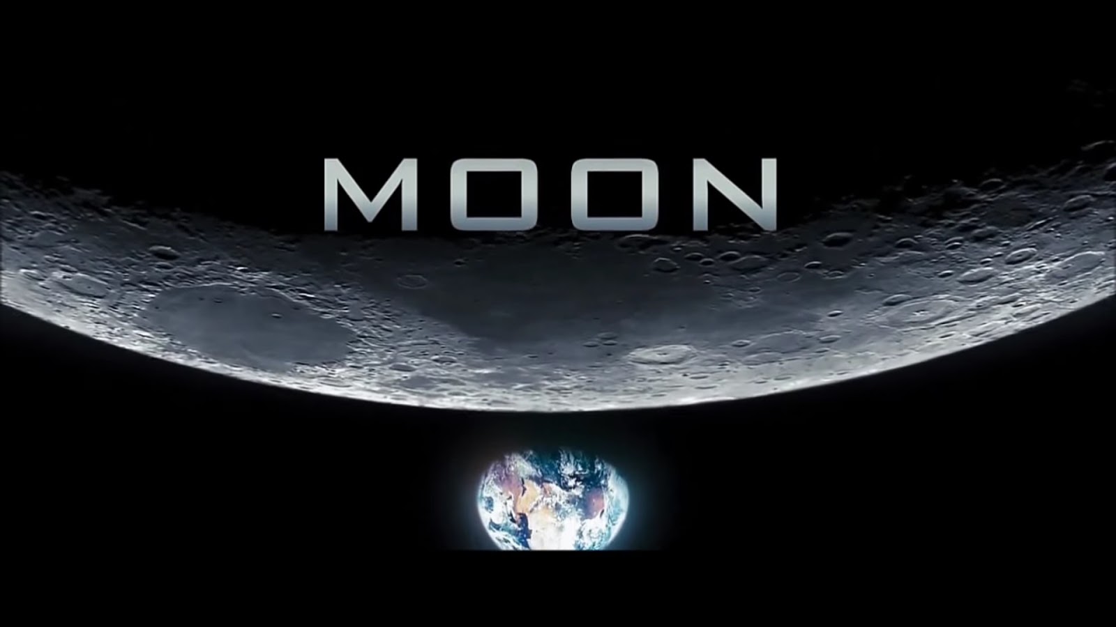
The font used for the
title does share connotations with the idea of Sc-Fi, it appears very
sleek, clean, almost perfect-looking. The design is very smart and
this of course has strong links to the ideas of Sc-Fi, being
futuristic and advanced. The text also has deeper connotations rooted
within it. There are large spacings in-between each letter in the
title and this could suggest two things: One, large spacings between
letters is commonly associated with computers/computing, usually to
make text distinguishable as well as the fact that cursive is very
difficult to pull when typed. Two, the large gaps could represent the
idea of isolation, each one being separated greatly from one another
and not linked in any way, emphasizing loneliness, an overarching
tone of the movie. This idea is backed up by the images on the
screen. Firstly: the Earth. Not only is it shown as being in the
abyss of space, it is also separate from the Moon and the title
itself, suggesting the idea that civilization and other humanly
contact is distant, bringing forward ideas of loneliness. This is also
combined with the text itself being featured on the dark side of the
moon for the last few seconds of the shot. Not only are you miles
away from human contact, they cannot even see you, cutting any
threads connected to home. It could be argued that not showing the
Earth at all would make these ideas more effective, however, by
showing that contact is possible, it makes the experience far more
lonely when contact is not being shared. Returning to the idea of the
dark-side of the moon, the blackness of this slowly creeps over and
behind the title as the camera tilts down to show the Earth. This
creates a foreboding tone right from the start, a potential threat
that something is wrong, which, if you have seen the movie, will make
A LOT of sense.
Sound is not as
effective in this opening as it was in my previous analysis, but it
still works to some effect, There is a non-diegetic score playing
during this title, which is an orchestrated piece. The music itself
sounds large but hopeful for the most part, however, during this
title segment, a sheer tone can be heard before fading into curious
piano sounds. This adds to the foreboding tone mentioned earlier. For
the most part though, this piece of music is actually rather
uplifting, the piano pieces sounding rather fun. This could play into
the uncanny valley idea, or a situation of false sense of security,
although the overall tone is positive, the foreboding sound plus
connotations of the text/image could suggest that things are not what
they seem, and although it seems innocent enough, as shown with the
analysis of the text, there may be serious problems. And if you have
seen the movie, again, this is rather interesting.
The only notable
editing techniques used here is the fade in from black. Although its
more of the camera panning down from the darkness of the moon to
reveal the title. This could link to the monologue given during the
opening which speaks about how far mankind has come in the premise of
this moving, almost as if emerging from the dark into a brighter
future, linking to the uplifting ideas of the music and the sleek
design of the text. However, this may also suggest that this darkness
is approaching the Earth, or effectively the human link in the title
sequence, again creating a foreboding atmosphere right from the
start. Also, the idea of this segment starting in pitch blackness
could link back to the ideas of loneliness presented earlier, the
idea that complete isolation is not far away at all.
 The smaller titles within the opening are vastly different from this one. The text appears almost 3D and built into the surroundings. The order of which they appear in is not very important. It lists all the production companies off first before naming several of the actors. The main focus of these titles is to create links with the sci-fi genre and showcase the set of the movie. As mentioned earlier, the text is appears almost built into the set, aligned with the running machine or walls. The text itself is very sleek and shiny. All of these points have connotations with the sci-fi genre, the sleekness feeling very futuristic and the blending into the environment feels ergonomic towards the set, strongly linking into the sci-fi genre. However, the main focus of the text blending into the surroundings is to show the surroundings, which gave a far greater impression of the main genre of the movie than any other factor, by placing them within these shots, the audience's attention is shifted onto these locations and, seeing the strong connections to sci-fi, may strongly appeal to the film's target audience.

Thanks for reading!
No comments:
Post a Comment