Thanks for reading!
Thursday, 17 December 2015
The Twentieth Day | Opening Pitch
"Treading through an overgrown, abandoned location, an apocalypse-ready character searches for an unknown individual amongst the run-down
buildings".
Wednesday, 16 December 2015
Opening Analysis | Oldboy
Oldboy is a Drama, Mystery and Thriller movie directed by Chan-wook Park in 2003. It stars Min-sik Choi as Dae-su Oh, a man who was imprisoned for fifteen year and seeks revenge on his unknown captors.


The film opens with a couple production company titles, starting with "Show East" and "Egg Films". These were the main companies behind the development of the movie, so it makes sense that these would be shown first. Text then appears in the native language of the movie, which, again, is the names of "Show East" and "Egg Films", before listing off several production companies in the same shot. By doing this, the movie quickens the time it takes to start, meaning they leave the audience losing interest to a minimum. There are also no titles of the actors who star in the movie, again, lowering the time it takes to start and possibly increasing the realism.

The opening shot of the movie is a low-angle close up of
Dae-su Oh’s hand gripping a tie, before the camera pans up to centre his head
in the shot. While the shot is lit naturally, Dae-su Oh is silhouetted out in
front of the sun, which is very nearly blocked out behind his head. The shot
does a very good job of making Dae-su very intimidating and scary. The low-angle
makes him seem very powerful, as he is looming over the camera or the audience.
Combined with the fact that Dae-su Oh is visibly shaking makes him seem
unstable, and that instability increases the tension as it suggest he has the
potential to do anything, be it violent or aggressive. Another connotation is
shown through the fact that Dae-su Oh nearly blocks out the sun. It greatly
emphasises his power, the fact he is able to obscure this thing that is
everywhere, that gives us life demonstrates his strength or power. The lighting
is also key, you can see Dae-su’s face or any details, it completely de-personalises
him, and by removing that human aspect you remove the possibility of mercy or
sympathy. Darkness is also commonly associated with the unknown which has deep
rooted connotations with fear, making Dae-su far more intimidating. The shot
being a close also makes Dae-su seem much larger and stronger.
 The following shot reveals that Dae-su is holding a man over the edge of building. This next shot is created in contrast to the first. It is at
a low-angle, looking down at the victim, making him seem smaller and weaker,
especially in comparison to the previous shot and Dae-su. The character is also
lit far lighter than the previous shot, again contrasting with the original
shot, making this character seem far less powerful. The high-key lighting also allows the audience to see the fear in the actors face, whilst in the previous shot Dae-su showed no emotion, again, making him far more intimidating. The shot is also a
mid-shot of the character, when, put into comparison against the close-up of
Dae-su, makes this character seem very small and therefore weaker. The use of low-angle also shows the ground and floor below, emphasising the height and the apparent danger of the situation. The previous only shows the sky and removes this danger possibility. Dae-su is also situated to the far right of the shot. This isolates him from the danger of the ground below, again, increasing his threat and power. Finally, the addition of the character holding a fluffy dog has connotations of being weak, almost like grasping a teddy bear, similar to small child. This further contrasts with Dae-su, making him an almost omnipotent force in this scene.
The following shot reveals that Dae-su is holding a man over the edge of building. This next shot is created in contrast to the first. It is at
a low-angle, looking down at the victim, making him seem smaller and weaker,
especially in comparison to the previous shot and Dae-su. The character is also
lit far lighter than the previous shot, again contrasting with the original
shot, making this character seem far less powerful. The high-key lighting also allows the audience to see the fear in the actors face, whilst in the previous shot Dae-su showed no emotion, again, making him far more intimidating. The shot is also a
mid-shot of the character, when, put into comparison against the close-up of
Dae-su, makes this character seem very small and therefore weaker. The use of low-angle also shows the ground and floor below, emphasising the height and the apparent danger of the situation. The previous only shows the sky and removes this danger possibility. Dae-su is also situated to the far right of the shot. This isolates him from the danger of the ground below, again, increasing his threat and power. Finally, the addition of the character holding a fluffy dog has connotations of being weak, almost like grasping a teddy bear, similar to small child. This further contrasts with Dae-su, making him an almost omnipotent force in this scene.
 The next shot is a close up of Dae-su's hand gripping the tie, before the shot pans across the tie to reveal the character hanging over the edge of the building. The fact the shot does not show Dae-su's face, again, strips him of emotion, and therefore fear or mercy, making him appear far more powerful. Also, his hand being at head level to the other character suggest he is looming over him; a powerful figure. While the shot pans left, it also slightly pans downwards as well, emphasising his smallness in comparison. Again, the shot gives the threatened character space to demonstrate fear, which further weakens him in comparison to Dae-su. The buildings in the background, whilst being blurred out, are all the rooftops or the very tops of the building, emphasising the height and the danger of the situation.
 The final shot is from the same angle as the first one, so it shares all the connotations. However, this shot eventually zooms into the darkness of Dae-su's face, possibly emphasising his lack of remorse or emotion for this character, increasing his potential for violence. The shot zooming in also completely allows Dae-su to block out the sun, massively increasing his connotations of power and strength, as mentioned before when analysing the opening shot.


During the opening, non-diegetic music is heard throughout. During the titles, it is a quiet piece, however, when the opening shot is shown, the music becomes much louder and far more dramatic. This increases the tension of the scene, and emphasises the severity and danger of the situation. No ambient diegetic sounds are audible, making the scene feel far less natural, which could link to the character of Dae-su in this shot, who is stripped of a lot of human emotion. Diegetic voices of the threatened character can be heard, which sounds like pleading in a very scared tone, again, making him seem far weaker in comparison to Dae-su.
Overall, the opening of this movie is short but sweet. It only uses a few shots but the connotations derived from them are massive. It sets up Dae-su to be this powerful figure, as well as creates numerous enigma codes for the audience to eventually decipher, the main one being the context of this shot, as well as why Dae-su is shown as so powerful, all through the use of media techniques.
Thanks for reading!
Saturday, 12 December 2015
Opening Analysis | Dredd
Dredd is a Sci-Fi and Action movie directed by Pete Travis in 2012. It is set in a violent, futurist city where the police have the authority to act as judge, jury and executioner. The narrative follows Dredd as he aims to take down a gang within one of the many mega block flats who supply a reality altering drug: SLO-MO.


An extreme-long shot
after this emphasises the power of the protagonist's size, just to
draw a comparison with the rioters, making both forces seem very
powerful, which leaves the audience expecting an exciting battle. The
shot has to pan up from the bottom of the tower to reveal the top,
which is shot at a high-angle, making the building seem much more
intimidating and therefore the police force far more intimidating.
Also in the shot are no other tall buildings, which greatly
emphasises the size of the tower in shot.

The title of the film
appears at the very end of the opening, speedily moving towards the
audience as debris flies away from it. The velocity and the debris
during the title all link to connotations of the Action genre,
engaging the target-audience.
During the opening,
non-diegetic is also played. The song itself feels very industrial
and heavy, featuring loud, metallic sounding drums. The heaviness and
the type of noise it makes relates strongly to the Action genre. The
song feels like it could be used in a big fight between two strong
forces, similar to the ideas that the opening implies. It also feels
very unnatural or robotic, possibly linking to the wasteland world of
the movie, which, as mentioned earlier, seems to have very little
organic life and seems polluted and dirty, ideas that are conveyed
through the music. It also matches the rioting action sequences as
well as working as good build up music during the 'montage'
cross-cutting sequence, increasing the tension.
Overall, the opening of this movie is intended to hype up the audience. They are given context into the violent dystopia of this future, as well as the major powers in this world (which are built up greatly throughout the opening). It leaves the audience anticipating more, which any good opening should hope to achieve, all through the use of media techniques.
Thanks for reading!
Friday, 11 December 2015
Connotations Of Horror Openings
The majority of these genre’s openings are crafted to create specific enigma codes for the audience, usually relating to the villain/antagonist of the feature. Most of these movies will either open with either the antagonist performing a killing or similar action, or with the result of the antagonist’s action. Basically, the audience is shown the danger of the antagonist, or given numerous unanswered questions relating to the antagonist of the narrative. For example:
The opening of The Ring is a prime example of this. The
audience is exposed to numerous unexplained shots, such as the static on the TV
or the very end in which the woman is killed by seemingly what is the
television. The opening provides zero explanation, just slowly builds up the
tension, which keeps the audience engaged, yet provides nearly zero context into the story, just creating enigma codes. The shots are feature a blue hue throughout and overall a visually dark tone, mainly to fit in with the connotations of horror. This usually contrasts with a following scene in which the tension is alleviated and the shots usually brighter.
A similar example of this would be the opening of The Conjuring. Again, the shot has a blue hue throughout and the brightness of significantly lower. Another feature not mentioned earlier is that many shots throughout these openings are stretched out, longer than the average shot length. This could be done to, again, increase the tension. The stillness of the shots could also contrast with speed of a jump scare, a connotation of many horror movies, which the audience will be expecting, also increasing the tension. To go back to the original point, however, the opening provides little context into the story. The conversation towards the end only creates more enigma codes for the audience to decipher as the movie continues. The unanswered question only grab the audience's interest and further develop the tension, which plays a key role within horror movies.
A similar example of this would be the opening of The Conjuring. Again, the shot has a blue hue throughout and the brightness of significantly lower. Another feature not mentioned earlier is that many shots throughout these openings are stretched out, longer than the average shot length. This could be done to, again, increase the tension. The stillness of the shots could also contrast with speed of a jump scare, a connotation of many horror movies, which the audience will be expecting, also increasing the tension. To go back to the original point, however, the opening provides little context into the story. The conversation towards the end only creates more enigma codes for the audience to decipher as the movie continues. The unanswered question only grab the audience's interest and further develop the tension, which plays a key role within horror movies.
Connotations Of Horror Genre
Unlike other genres, many Horror movies follow a formula that are very similar to each other. Genres such as Drama or Sci-Fi or even subgenres of these all allow for a variety of combinations or differences that can change the connotations. If you compare Star Trek and Mad Max, both films offer VERY different expectations, yet both can easily be placed into the Sci-Fi and Action genre. Horror movies, however, differ from this. While the settings and environment can be changed, the audience's expectations are usually very similar. Most feature an entity, be it human or not, that preys on protagonists, who usually are young adults. Basically, the antagonist is something that hunts on the protagonist and has considerable power over them. Their appearance or costume is usually unnerving, even if it is sometimes standard clothing. Something will bring up the creepiness factor on them. For example:


Another key idea used in horror movies is that the audience is usually not exposed to the antagonist until the later half of the movie, OR during the opening. This is done for a similar effect as the opening, it keeps the audience guessing and interested, as they want to see the villain, who usually command power, as shown by their workings throughout the first half, be it in the form of killings, like Sinister, or other-worldly events like Paranormal Activity.
The most essential part of horror movies, however, is the horror. Many modern horror movies use jump scares to scare the audience, building up the volume and tension and then either using a fast cut or loud sound, either diegetic or non-diegetic to catch the audience off guard and make them jump, which then keeps them guessing when the next one will occur, increasing the horror of the movie. Other films within this genre tend to focus on disturbing imagery to make the audience uncomfortable, like Silence Of The Lambs. It focuses on the psychology of the antagonists to make the audience disturbed, rather than jump scares. While this is a more natural form of horror, it usually does not provide the same level of excitement as jump scares. The choice of which one to use depends on how realistic and immersive you want the movie to be. I believe the latter will be more effective for my opening, as I plan to make the setting as immersive as possible, and shrill, non-diegetic music and fast cuts will hinder this effect.
Thanks for reading!
Sunday, 6 December 2015
Production Company Logo Ideas
Part of our course involves creating a logo for a production company that would of helped produce the movie we are creating the opening for.
The initial idea for my company was 'Bell Tower', however, I felt this name seemed too generic and uninspired, as well as the fact that this was already the name for numerous companies. I settled on 'Fire Exit', mainly due to the fact that I felt this to be more original and memorable in comparison to 'Bell Tower'.
Below is my first concept design for the logo:

The background being black works great as it can easily be blended into dark/black segments within movies, the white contrasting this, making it clearly visible. The font in this version is more true to actual fire exit signs, however, I felt it looked too weak and did not catch the audience's eye, as well as not fitting in with the boldness of the logo. Below are two later versions:


The first image above was headed in the right direction, but I still felt that it lacked that eye-catching impact needed to make it memorable. It also, again, seemed out of place in comparison to the thickness of the image. The second one fixes that issue, but leaves a large empty space on the right. Not only this, but all these images leave a blank space below the text, making the logo feel less cohesive.

I tried to solve this issue by creating a border around the image and text, however, this still left a blank space below the text, even if it did make the logo feel more cohesive and professional.

I revamped the design of the logo in my next version, moving the text below utilized the space better and made it look far more professional. The font now matched the boldness of the image and also lined up correctly with it.

In my final version I added a border to make the logo look far more professional, however the way the image is created leaves an empty space next to the image, which takes away from the professionalism. I decided to revert this step and return to the previous version, which I believed looked far better.

The initial idea for my company was 'Bell Tower', however, I felt this name seemed too generic and uninspired, as well as the fact that this was already the name for numerous companies. I settled on 'Fire Exit', mainly due to the fact that I felt this to be more original and memorable in comparison to 'Bell Tower'.
Below is my first concept design for the logo:


I tried to solve this issue by creating a border around the image and text, however, this still left a blank space below the text, even if it did make the logo feel more cohesive and professional.

I revamped the design of the logo in my next version, moving the text below utilized the space better and made it look far more professional. The font now matched the boldness of the image and also lined up correctly with it.

In my final version I added a border to make the logo look far more professional, however the way the image is created leaves an empty space next to the image, which takes away from the professionalism. I decided to revert this step and return to the previous version, which I believed looked far better.
Final version!
Thanks for reading!
Monday, 23 November 2015
Opening Analysis | Goodfellas
Goodfellas is a 1990 Biography, Crime and Drama movie directed by Martin Scorsese (ALSO THE BEST MOVIE FOREVER). It stars Ray Liotta, Joe Pesci and Robert Di Niro as gangsters during the 50’s, 60’s, 70’s and 80’s. The opening of this movie is rather dark and brings the audience right into the life of a gangster.

Firstly, the opening credit titles of the movie are rather
strange in comparison to the genres of the movie. The titles speed past, with
accompanying sounds of cars speeding past. Normally, you would associate this
with an action, even racing movie. However, it could be used here to represent
the fast, dangerous world of gang life, the rush of excitement and the danger
it brings. It also serves another purpose. As mentioned earlier, there are
sounds of cars speeding past in time with the text. This is actually diegetic
and the sounds of actual cars driving past, as shown by the following shots of
the three main characters above driving. This could have been done because at
this moment and when they are driving the audience is unaware that they have a
dying man in the boot of their car, the same as the cars driving past. It puts
us into the same position as the other drivers, completely unaware of the life
these people lead, and that they could be anyway, and you would not even
notice. Heightening the reality as well as excitement of the movie, strongly
linking it to the crime genre also.
The titles are also shown in a specific order: ‘Warner Bros.
Presents’ – ‘An Irwin Winkler Production’ – ‘A Martin Scorsese Picture’ –
‘Robert Di Niro’ – ‘Ray Liotta’ – ‘Joe Pesci’ – ‘Lorraine Bracco’ – ‘And Paul
Sorvino’. The titles are placed in order of importance, Warner Bros being the
largest movie companies would obviously have a front row position. Martin
Scorsese, a much respected director, very well acclaimed. Robert Di Niro even
comes before Ray Liotta, despite not being the main character, due to his fame
and position in the acting world. The order is purposely done to introduce the
big stars, the heavy hitters, to the audience in order to create excitement, to
increase the interest in the movie. This may have also been done to relate to
the genres, Robert Di Niro is very well known for his crime and drama movies, especially
at the time this movie was released. By showing him first, it can directly
appeal to the target audience of the Crime and Drama genres.
The final title of the opening: “This film is based on a
true story” also relates to the genres. Of course, this directly links to the
Biography genre, but the audience, knowing this is also a Crime/Drama starring
Robert Di Niro, can expect a very tense movie. This, combined with the
knowledge that this is based on a true story, increases the tension greatly, as
the realism is increased. Demonstrating how the opening titles are used effectively.
 The first shot of the
movie is a mid shot showcasing the back of car before panning round
to the side. The shot itself establishes a rather uncanny effect.
While what is shown would usually be considered normal, the use of
mise en scene and sound crates a foreboding effect. Firstly, there is
a distinct lack of music during the shot, or many sounds altogether,
(the only dominant one being the diegetic engine of the car). It
raises numerous enigma codes, the audience would expect some ambient
sounds or radio music, but instead receive just the sound of the
engine. It's almost too quiet. The lack of sounds creates what would
normally be a common sight into something more menacing, almost as if
the car is hiding something, attempting to be inconspicuous. This
idea is developed by the fact that the car is travelling in what
seems to be an empty road, very late at night. The low key light not
only disables the audience from seeing where the car is headed,
creating tension as well as questions, but it, again, has
connotations with trying to keep hidden, the idea of keeping in the
shadows. This links in with the themes of the opening as well as the
overarching themes of the movie. In fact, the only lights within this
shot are the rear lights, a searing red colour protruding from the
back of the car. Red is commonly associated with danger, it has
negative connotations but also draws attention to itself. By using
these red rear lights, the audience's attention is drawn to the boot
of the car, possibly foreshadowing the end of the opening as well as,
one more time, creating a foreboding tone throughout the shot. The
audience is unaware of what is happening but through the use of media
techniques the atmosphere created is unsettling, making the opening
far more intense and engrossing to the audience.
The first shot of the
movie is a mid shot showcasing the back of car before panning round
to the side. The shot itself establishes a rather uncanny effect.
While what is shown would usually be considered normal, the use of
mise en scene and sound crates a foreboding effect. Firstly, there is
a distinct lack of music during the shot, or many sounds altogether,
(the only dominant one being the diegetic engine of the car). It
raises numerous enigma codes, the audience would expect some ambient
sounds or radio music, but instead receive just the sound of the
engine. It's almost too quiet. The lack of sounds creates what would
normally be a common sight into something more menacing, almost as if
the car is hiding something, attempting to be inconspicuous. This
idea is developed by the fact that the car is travelling in what
seems to be an empty road, very late at night. The low key light not
only disables the audience from seeing where the car is headed,
creating tension as well as questions, but it, again, has
connotations with trying to keep hidden, the idea of keeping in the
shadows. This links in with the themes of the opening as well as the
overarching themes of the movie. In fact, the only lights within this
shot are the rear lights, a searing red colour protruding from the
back of the car. Red is commonly associated with danger, it has
negative connotations but also draws attention to itself. By using
these red rear lights, the audience's attention is drawn to the boot
of the car, possibly foreshadowing the end of the opening as well as,
one more time, creating a foreboding tone throughout the shot. The
audience is unaware of what is happening but through the use of media
techniques the atmosphere created is unsettling, making the opening
far more intense and engrossing to the audience.


The next shot is
equally important, albeit for different reasons. The mid shot
showcases the three main characters of the movie: Henry Hill (Ray
Liotta), James Conway (Robert Di Niro) and Tommy DeVito (Joe Pesci)
sitting inside the car. Jimmy is asleep and Tommy is sitting relaxed
in the back while Henry drives. The car is dimly lit and overall has
a very relaxed atmosphere. Even when the diegetic sounds of emerging
from the boot begin, it still maintains that tone. Henry, swearing,
suggest that the relationship is friendly. This is done for a
specific purpose. It directly contrasts with not only the previous
shot, but the following shots also. This juxtaposition is to
demonstrate the unsettling nature of the gangster lifestyle. It
emphasises the fact that these people think that murder, arson and
drugs are part of everyday, normal life. Car headlamps in the
background suggest that these people are living in plain sight, but
you cannot tell because, as shown in the previous shot, they blend.
Combine this with the 'true story' title, and you create a very tense
opening, brining the realism of a Biopic and an opening that quickly
introduces you to this life, again, through the use of specific media
techniques.

The next shot is a long shot of the three men standing behind the car, the red headlamps illuminating them. Again, a similar lighting effect is employed that was used in the first shot. The red representing danger, it is a very negative colour and foreshadows the events of the opening and the themes of the movie. The light also illuminating the main characters gives connotations into their lives, and the danger but exciting themes associated with it. The rest of the shot is still dimly lit, the only lit items being the characters and the boot of the car. This, again, suggests that they are hiding this life, making the whole movie far more realistic and therefore tense. The use of light also only draws attention to the car and the actors, and my highlight the fact that men are friend, as they bask in the same light, as well as the same profession, continuing that idea from the second shot.
 This next shot also highlights the relationship between the
actors, as well as continuing the theme of staying hidden. Within the shot, you
see James Conway and Tommy DeVito exchange glances as the camera moves closer,
becoming a mid-shot from a long shot. The camera moving closer, hiding more of
the background and showcasing the characters could represent their
relationship, a close, friendly one, which relates to the themes of the movie
in the fact that your gangster friends become your family, or your life. The
shot also shows Joe Pesci’s character reaching into his suit jacket pocket for
what we assume is a weapon of some sort, yet it remains hidden from the
audience. This could also represent the ideas of hiding in plain sight, which
were similarly explored in previous shots. This is emphasised by the following
shots in which this weapon is actually a large knife. This subverts the
audience’s expectations, many would expect this to be a gun. The fact a knife
is used demonstrates the brutality of the gangster lifestyle and continues the
following themes of hiding something dangerous in plain sight. Increasing the
tension of the movie; keeping the audience entertained. This shot is also a slight high-angle, further developing the connotations of danger and power suggested earlier, as the subject targets appear larger and looming.
This next shot also highlights the relationship between the
actors, as well as continuing the theme of staying hidden. Within the shot, you
see James Conway and Tommy DeVito exchange glances as the camera moves closer,
becoming a mid-shot from a long shot. The camera moving closer, hiding more of
the background and showcasing the characters could represent their
relationship, a close, friendly one, which relates to the themes of the movie
in the fact that your gangster friends become your family, or your life. The
shot also shows Joe Pesci’s character reaching into his suit jacket pocket for
what we assume is a weapon of some sort, yet it remains hidden from the
audience. This could also represent the ideas of hiding in plain sight, which
were similarly explored in previous shots. This is emphasised by the following
shots in which this weapon is actually a large knife. This subverts the
audience’s expectations, many would expect this to be a gun. The fact a knife
is used demonstrates the brutality of the gangster lifestyle and continues the
following themes of hiding something dangerous in plain sight. Increasing the
tension of the movie; keeping the audience entertained. This shot is also a slight high-angle, further developing the connotations of danger and power suggested earlier, as the subject targets appear larger and looming.


The next shot is a long shot of the three men standing behind the car, the red headlamps illuminating them. Again, a similar lighting effect is employed that was used in the first shot. The red representing danger, it is a very negative colour and foreshadows the events of the opening and the themes of the movie. The light also illuminating the main characters gives connotations into their lives, and the danger but exciting themes associated with it. The rest of the shot is still dimly lit, the only lit items being the characters and the boot of the car. This, again, suggests that they are hiding this life, making the whole movie far more realistic and therefore tense. The use of light also only draws attention to the car and the actors, and my highlight the fact that men are friend, as they bask in the same light, as well as the same profession, continuing that idea from the second shot.


Once the three men open
the boot of the car the audience are greeted with a bloodied man
begging for his life in a raspy voice. This is perhaps the most
important shot in the opening, in any case, the scene showing the
death of this character is definitely the most important. Several
media techniques are utilised here to bring the audience right into
the life of gangster. The shot continues to employ the red lights of
the car, highlighting the danger of living like this, as well as the
danger that this bloodied man was in. The lights in previous shots
were almost foreshadowing the man in the boots eventual death. The
camera is also shot at a low-angle, contrasting with the previous
shot (being the high angle), creating a greater impression that this
man is weak, not only in comparison to the other three, but also to
the audience. This could possibly make the scene darker as they are
killing a man weaker then them already, demonstrating their
ruthlessness. The sound is also key during this shot. While there is
some diegetic ambient tone, the main thing the audience can hear is
just this man begging Joe Pesci's character not to kill him. This,
again, makes him seem weaker, makes the kill far less justified from
the audience's perspective, and continues to show the life of a
gangster as being brutal. This is backed up by the following shot
showing Joe Pesci's character stabbing the man multiple times. This
shot is also effective as, obviously a knife is a very brutal weapon,
the multiple stabbings emphasising this, but also the fact that the
camera does not cut away from the stabbing, the audience experiences
it right before their eyes, the true life of a gangster.
 And the final act of
this brutality is committed in the next shot. Robert Di Niro's
character stands over the boot and unloads four rounds of his
revolver into the man. This is similar to the stabs, in which an
excessive use of force is delivered, again, demonstrating the
brutality of this life. However, the use of a mid shot also allows
the audience to see all three men stand there and watch this display
of brutality. Each character stands over the boot and looks down as
the man is riddled with bullets. Not only does this emphasise the
brutality, as it shows a three on one scenario, the shot also does
not show the man in the boot of car when he is being shot from this
angle, almost like the three are attacking a man already down on the
ground, just to be more violent. The diegetic sounds of the gun and
the bullets tearing into the flesh again devour any of the diegetic
ambient sounds of insects, just to draw attention to the violent
nature of this life and scene. The shooting segment ends with a close
up of the blood on the white sheets covering the man. This could be
the ultimate symbol of gangster life: the fact that no matter what,
blood will be spilled.
And the final act of
this brutality is committed in the next shot. Robert Di Niro's
character stands over the boot and unloads four rounds of his
revolver into the man. This is similar to the stabs, in which an
excessive use of force is delivered, again, demonstrating the
brutality of this life. However, the use of a mid shot also allows
the audience to see all three men stand there and watch this display
of brutality. Each character stands over the boot and looks down as
the man is riddled with bullets. Not only does this emphasise the
brutality, as it shows a three on one scenario, the shot also does
not show the man in the boot of car when he is being shot from this
angle, almost like the three are attacking a man already down on the
ground, just to be more violent. The diegetic sounds of the gun and
the bullets tearing into the flesh again devour any of the diegetic
ambient sounds of insects, just to draw attention to the violent
nature of this life and scene. The shooting segment ends with a close
up of the blood on the white sheets covering the man. This could be
the ultimate symbol of gangster life: the fact that no matter what,
blood will be spilled.
 The final shot of the
opening holds several connotations into, not the life of a gangster,
but why these people get involved with this lifestyle. To start,
similar to before, a high angle shot of Ray Liotta's character is
used to, again, show power, maybe suggesting why these people get
involved in this life. The shot shows him slamming down the boot of
the trunk, almost as if blocking out what just happened, removing it
from the scene, choosing to ignore it. Combine this with his diegetic
monolouge: “As far back as I can remember I always wanted to be a
gangster” and his unconcerned face. Not only does the audience now
realise that this is the life of a gangster, but that these people
involved are used to this, this is their life, their job. This may
catch the audience of guard, as this is not how most people would
react to a situation like this, it does, however, create a great
sense of character for these men. The shot ends with a freezeframe of
Ray Liotta's character's face, encompassing these people's reactions
to their lives: it is their job and the non-diegetic song “Rags to
Riches” by Tony Bennett beings to play. The song encompasses the
time the movie is set in, as well as providing a juxtaposition from
the previous scene, perhaps further developing the characters, not
only is this their life, they enjoy it, as demonstrated by the upbeat
song. The title of the movie then pops up in the same fashion as
previous titles, however, this time the text is in red. This could
continue the theme of danger present throughout, combined with the
fast movment of the text, the audience gets the idea that gangster
life is exciting, tense and full of danger, all in an effort to gain
their interest.
The final shot of the
opening holds several connotations into, not the life of a gangster,
but why these people get involved with this lifestyle. To start,
similar to before, a high angle shot of Ray Liotta's character is
used to, again, show power, maybe suggesting why these people get
involved in this life. The shot shows him slamming down the boot of
the trunk, almost as if blocking out what just happened, removing it
from the scene, choosing to ignore it. Combine this with his diegetic
monolouge: “As far back as I can remember I always wanted to be a
gangster” and his unconcerned face. Not only does the audience now
realise that this is the life of a gangster, but that these people
involved are used to this, this is their life, their job. This may
catch the audience of guard, as this is not how most people would
react to a situation like this, it does, however, create a great
sense of character for these men. The shot ends with a freezeframe of
Ray Liotta's character's face, encompassing these people's reactions
to their lives: it is their job and the non-diegetic song “Rags to
Riches” by Tony Bennett beings to play. The song encompasses the
time the movie is set in, as well as providing a juxtaposition from
the previous scene, perhaps further developing the characters, not
only is this their life, they enjoy it, as demonstrated by the upbeat
song. The title of the movie then pops up in the same fashion as
previous titles, however, this time the text is in red. This could
continue the theme of danger present throughout, combined with the
fast movment of the text, the audience gets the idea that gangster
life is exciting, tense and full of danger, all in an effort to gain
their interest.
Hopefully by now you will be able to see how different media techniques are employed throughout the opening to give the audience valuable information. They learn that this is a dangerous, but exciting life, and that these kinds of people may be around us in plain sight. This greatly increases the tension as well as the excitement factor the audience has going into the movie, demonstrating the effectiveness of the opening.


Hopefully by now you will be able to see how different media techniques are employed throughout the opening to give the audience valuable information. They learn that this is a dangerous, but exciting life, and that these kinds of people may be around us in plain sight. This greatly increases the tension as well as the excitement factor the audience has going into the movie, demonstrating the effectiveness of the opening.
Thanks for reading!
Tuesday, 17 November 2015
Opening Analysis | Terminator 2
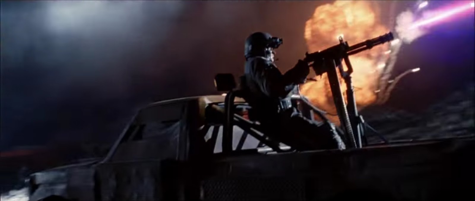
Terminator 2 is a 1991 Sci-Fi, Action movie directed by James Cameron. The film is set in during its release date, however, the opening takes place in the future during the aftermath of a nuclear war in which humanity faces a new threat: Androids.
The main
purpose of the opening is to give the rest of the movie taking place
meaning. The audience is shown the apocalyptic future that houses the
remainder of humanity right from the start. This sets the tone of the
movie as the consequences of the failure of John Connor surviving
results in the end of humanity, which greatly increases the tension
throughout the film. The main purpose of the opening is to provide
background information to the audience and, more importantly, to
drive home the point that if John Connor dies, so does the species.
The opening employs multiple media techniques to enforce this idea.

Right from
the start, these ideas are put into place. There are no titles and no
music. By removing these artificial elements, the height of the
realism is greatly increased, which in turn increases the tension as
the stakes of the human race are heighted, as the threat is very
real. The first shot is very effective in showing the despotic
future. It features a skeleton pressed against the steering wheel of
an abandoned wrecked car. The skeleton here, obviously, represents
the death of humanity and points to the outcome of humans if John
Connor dies. The fact the skeleton is in the car is also important.
The car is a huge part of human life: they are everywhere and for
most people essential devices. While a skeleton could represent the
end of humanity, it could also just emphasise a singular death. By
showing the destruction of an essential human device, it represents
the end of the human way of life in general. We are dying and so is
how we live. Demonstrating the effectiveness of this scene. The shot
being a mid-shot also allow it to encompass more. While the focus is
on the skeleton, the audience can also see numerous destroyed cars as
well as buildings. All of these are representative of our species and
seeing them destroyed on such a massive scale emphasises the current
state of humanity and what would happen if John Connor dies. This
point is further shown by the camera pans out and reveals an extreme
long shot of numerous destroyed cars and buildings. The fact the shot
is extremely long shows the sheer scale of destruction and
foreshadows the potential devastation if John Connor were die,
greatly increasing the tension throughout the movie.

At
twenty-three seconds a similar tactic is employed. The shot shows a
child's play park desecrated by the nuclear war. This is done for
very similar reasons to the previous shot, as it shows a key
representation of humanity destroyed. The fact the shot is a play
park is possibly more effective than before as children are often
seen as innocent, so the shot could infer that not even the most
innocent people are safe unless John Connor lives.
However, the
most important representation of these connotations takes place at
forty-one seconds in:

This close up
of the skull being shattered by the stomp of an android. Simply put,
the skull is the ultimate representation of humanity and the shot
being close up only makes it more personal. The shot is also low
angle on the skull, showing how humanity is seen as weak and dying at
the moment. The skull is shattered, not only showing the state of the
species at the moment but also the end of the species if the
Terminator fails and John Connor dies. This shot that pans into a
high-angle mid shot of the terminator that crushed the skull. Not
only did this machine crush humanity, but the high-angle shot makes
it out that these robots are far superior to humans, again,
demonstrating the consequences of the movies narrative.

A shot at
fifty-five seconds enforces this idea, showing caterpillar tracks
traversing over a pile of human skulls. The large amount of skulls
demonstrates the sheer destruction of humanity while the caterpillar
tracks are a bold reminder of war and reinforces the fact humans are
in a very deep struggle:

The following
shots decrepit a full-scale battle between humans and robots. The
scenes make effective use of juxtapositions and camera angles, as
well as mise en scene to further develop the narrative situation of
the opening.
Firstly, the
juxtaposition takes place by showing the weaponry at disposal between
the two opposing factions in the war. We are shown the androids with
advanced tank-looking vehicles as well as flying artillery. It is all
very futuristic and also has strong links to Sci-Fi, one of the films
genres. In comparison, we see the humans ONLY war vehicle being a
rusted truck. There is a huge contrast between the tech being fought,
which again creates the image that humans are on their last legs, as
well as the fact that the androids are superior.

This idea is
also demonstrated through the camera angles. The shots of the robot's
weaponry mainly consist of high-angle shots, which as mentioned
earlier, gives a sense of power or superiority to the machines.

These scenes
also showcase numerous deaths of human soldiers, many killed by
lasers (again, Sci-Fi links),others by explosions (links to action
genre). This is important as not only appeals to the target audience,
the fans of those genres, very early in the movie thus gauging their
interest, it also shows that humans are being wiped out by these
machines in large numbers. This links to the consequences of the
narrative which in turn increases the intensity and suspense of the
whole movie, as well as linking to the Sci-Fi genre.
The sound is also
another important aspect in this opening. As soon as the the intro
begins, the only sounds are diegetic, ambient noises of wind and
creaking metal. This is effective as it creates a strong sense of
emptiness or desolation, the idea that there is no life, it is
completely void. Not only does this link to the previous ideas of the
end of human existence, but it could also link to the idea of the
androids. There is no life, but there are robots. The text during the
first shot also has similar connotations, saying:'Los Angles
2029AD' In 1991, this would
still be a long time away, as it is now, however, in both cases, this
time is the near future, its a future that exists within our
lifetime, making the connotations of the end of the human race far
more scary and bleak.
During
the opening there is also a monologue performed by the character:
Sarah Conner. This non-diegetic voice-over is important is it
provides the audience with the context of the opening, making the
previously demonstrated connotations far more effective, as they now
understand what is at stake. The speech itself is also effective in
demonstrating the scale of the destruction: saying “Three billion
human lives ended...”. This is a surprising figure that may catch
the audience off guard, gaining their interest, as well as painting a
bleak picture for the survival of humanity. The fear factor of this
raised higher by the fact that it is stated that this event took
place in 1997, a mere six years after the films release. This harks
back to the idea of the event taking place within our lifetimes. It
increases the tension dramatically when the audience feels involved
with the world, demonstrating how sound is used to effect in the
opening.
Sound
is also used to create links to the Sci-Fi genre in the opening. The
battle is very futuristic, with laser guns being fired and impossible
looking machinery. The sounds used here all feel very spacey,
combined with the scenes of all out-war raging between the machines
and humans, the whole opening has strong connections to both Sci-Fi
and Action.
There is also non-diegetic music taking place during the fighting scenes. The music itself is very held-back for the most part, it is mainly just a pulsating tone. This itself has links to the the sounds of machines, that consistent, mechanical sound groaning as it moves. It feels very alien and unnatural, the opposite of a human. The music also has some very sharp, shrill tones during scenes when humans are killed (I.e 1:09 seconds in), potentially increasing the scare factor and the disturbing nature of his opening. However, there are also scenes where the music is inaudible, adding to the realism of the opening, which in turn increases the tension as it makes the whole event seem very real and therefore more plausible. Demonstrating how sound is used effectively during the opening.
The
editing used during this opening is very simple. There is only one
transition used and that is at the very end of the opening, in which
a shot of John Conner fades into an explosion, which could show the
human race being wiped away, (this also corresponds with the
monologue at the time, which outlines the machine's mission to kill
John Conner). For the most part, however, there is very little
editing used. The very start, before the fighting, consists of only
two shots, which pan and showcase the environment. This lack of
editing movement or cuts not only increases the realism and therefore
tension, but also this lack of movement could link to a lack of life,
as nothing is moving. When the action sequence of the opening
commences, there are numerous fast cuts, which is strongly linked to
the action genre of this movie.
In conclusion, Terminator 2's opening employs the use of many media techniques in some areas, like camera work or mise en scene, and little in others to portray a bleak vision of the human existence. The techniques used all come together to paint a realistic, and therefore scarier, environment, giving the audience context into the movie, (which only increases the tension) as well as demonstrating the genres within the first few minutes, appealing to the target audience.
Thanks for reading!
Wednesday, 11 November 2015
Title Analysis #2
Moon
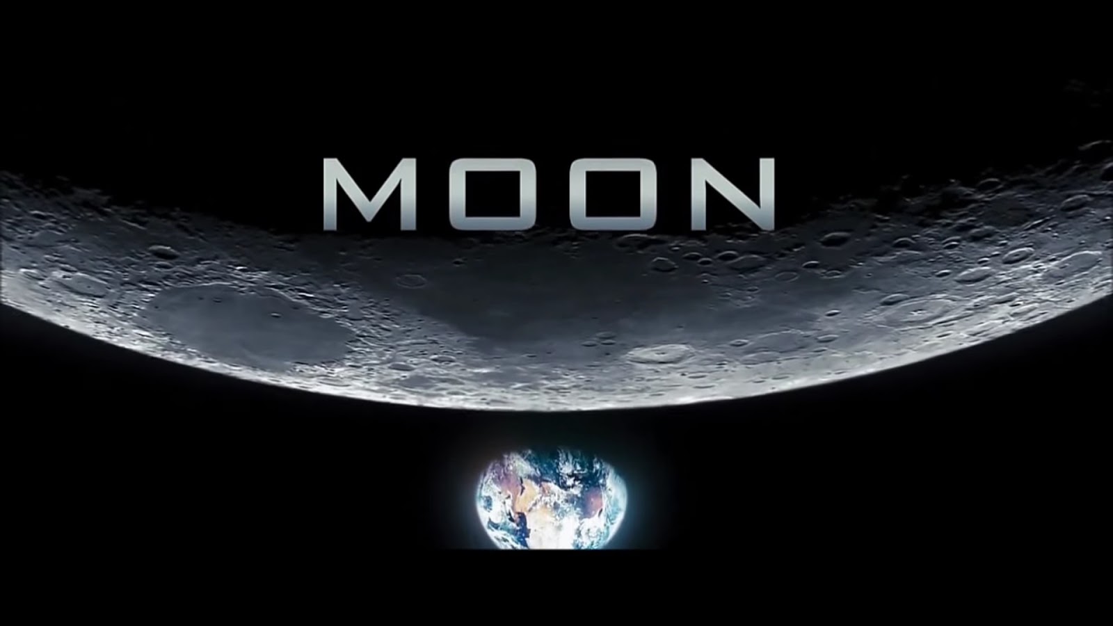
Moon is a Sci-Fi, Drama
directed by Duncan Jones in 2009 featuring Sam Rockwell, who stars as
Sam Bell, an astronaut working in an energy station on the surface of
the moon.
The font used for the
title does share connotations with the idea of Sc-Fi, it appears very
sleek, clean, almost perfect-looking. The design is very smart and
this of course has strong links to the ideas of Sc-Fi, being
futuristic and advanced. The text also has deeper connotations rooted
within it. There are large spacings in-between each letter in the
title and this could suggest two things: One, large spacings between
letters is commonly associated with computers/computing, usually to
make text distinguishable as well as the fact that cursive is very
difficult to pull when typed. Two, the large gaps could represent the
idea of isolation, each one being separated greatly from one another
and not linked in any way, emphasizing loneliness, an overarching
tone of the movie. This idea is backed up by the images on the
screen. Firstly: the Earth. Not only is it shown as being in the
abyss of space, it is also separate from the Moon and the title
itself, suggesting the idea that civilization and other humanly
contact is distant, bringing forward ideas of loneliness. This is also
combined with the text itself being featured on the dark side of the
moon for the last few seconds of the shot. Not only are you miles
away from human contact, they cannot even see you, cutting any
threads connected to home. It could be argued that not showing the
Earth at all would make these ideas more effective, however, by
showing that contact is possible, it makes the experience far more
lonely when contact is not being shared. Returning to the idea of the
dark-side of the moon, the blackness of this slowly creeps over and
behind the title as the camera tilts down to show the Earth. This
creates a foreboding tone right from the start, a potential threat
that something is wrong, which, if you have seen the movie, will make
A LOT of sense.
Sound is not as
effective in this opening as it was in my previous analysis, but it
still works to some effect, There is a non-diegetic score playing
during this title, which is an orchestrated piece. The music itself
sounds large but hopeful for the most part, however, during this
title segment, a sheer tone can be heard before fading into curious
piano sounds. This adds to the foreboding tone mentioned earlier. For
the most part though, this piece of music is actually rather
uplifting, the piano pieces sounding rather fun. This could play into
the uncanny valley idea, or a situation of false sense of security,
although the overall tone is positive, the foreboding sound plus
connotations of the text/image could suggest that things are not what
they seem, and although it seems innocent enough, as shown with the
analysis of the text, there may be serious problems. And if you have
seen the movie, again, this is rather interesting.
The only notable
editing techniques used here is the fade in from black. Although its
more of the camera panning down from the darkness of the moon to
reveal the title. This could link to the monologue given during the
opening which speaks about how far mankind has come in the premise of
this moving, almost as if emerging from the dark into a brighter
future, linking to the uplifting ideas of the music and the sleek
design of the text. However, this may also suggest that this darkness
is approaching the Earth, or effectively the human link in the title
sequence, again creating a foreboding atmosphere right from the
start. Also, the idea of this segment starting in pitch blackness
could link back to the ideas of loneliness presented earlier, the
idea that complete isolation is not far away at all.
 The smaller titles within the opening are vastly different from this one. The text appears almost 3D and built into the surroundings. The order of which they appear in is not very important. It lists all the production companies off first before naming several of the actors. The main focus of these titles is to create links with the sci-fi genre and showcase the set of the movie. As mentioned earlier, the text is appears almost built into the set, aligned with the running machine or walls. The text itself is very sleek and shiny. All of these points have connotations with the sci-fi genre, the sleekness feeling very futuristic and the blending into the environment feels ergonomic towards the set, strongly linking into the sci-fi genre. However, the main focus of the text blending into the surroundings is to show the surroundings, which gave a far greater impression of the main genre of the movie than any other factor, by placing them within these shots, the audience's attention is shifted onto these locations and, seeing the strong connections to sci-fi, may strongly appeal to the film's target audience.

Thanks for reading!
Subscribe to:
Posts (Atom)